Category: Development

  • Composition Over Splitting: How to Think About Code Organisation

    Composition Over Splitting: How to Think About Code Organisation

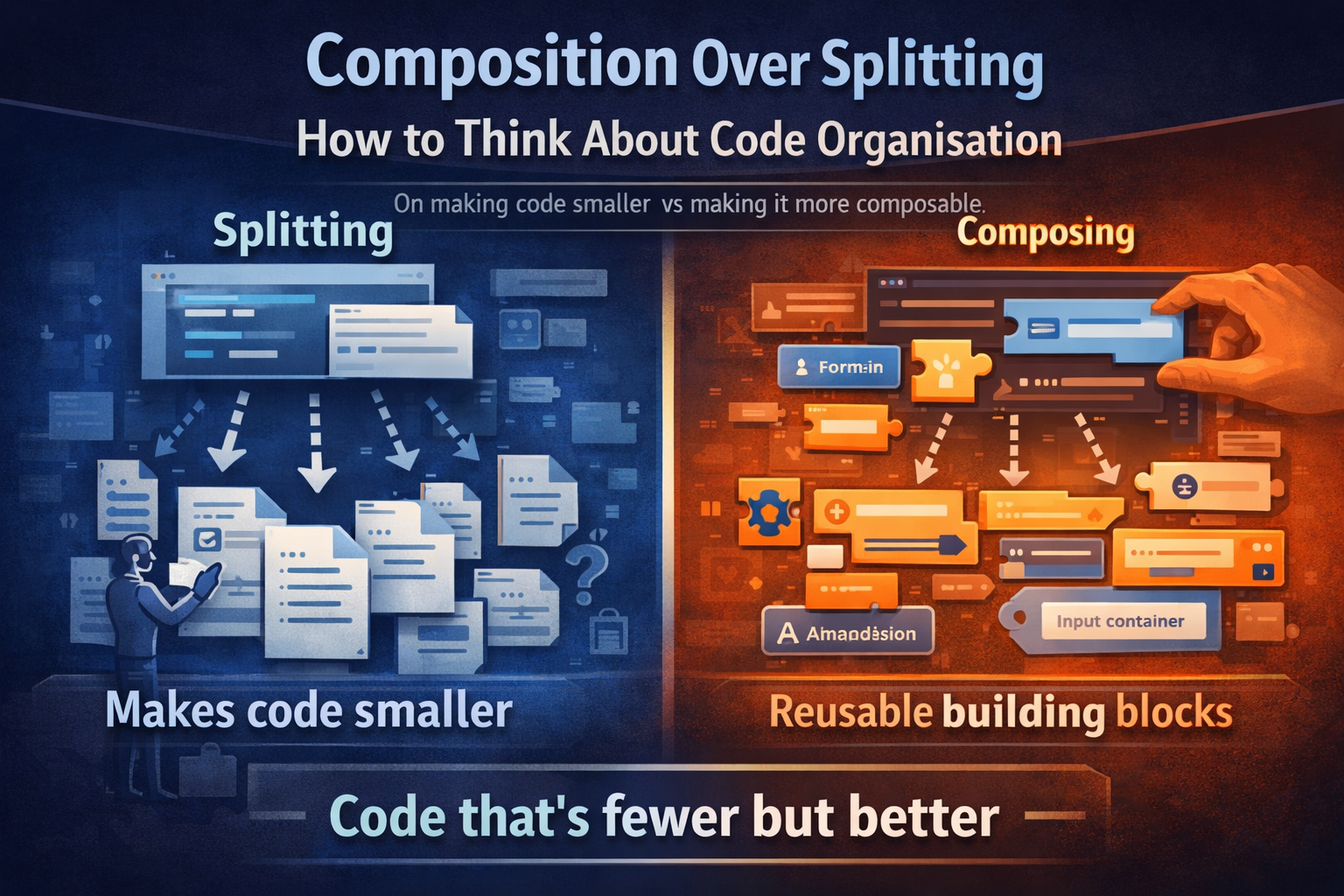
    On the difference between making code smaller and making it more composable — and why one of those is actually the goal.


    The Instinct

    A component or function gets long. It becomes hard to scan, hard to navigate, hard to reason about. The natural response is to cut it into pieces — pull sections out into their own files, give them their own names, and call it organised.

    It feels productive. The original file shrinks. Things have names. Job done.

    But often, nothing has actually improved. The complexity hasn’t been addressed — it’s been distributed. You now have more files, more component boundaries, more indirection, and the same underlying structure hiding across all of them. Navigation got harder, not easier.

    The question worth asking before reaching for the split is: what is actually causing the size?


    Two Different Problems, One Symptom

    A large component or function can be large for two very different reasons:

    1. Variable bleeding and scope pollution
    A function has grown so wide that local variables from one block are visible in — and accidentally affecting — another. The cognitive overhead isn’t the length, it’s the entanglement. Here, extracting a function or class makes genuine sense: you’re not just moving code, you’re creating a boundary that enforces isolation. The extracted unit has its own scope, its own inputs and outputs, its own contract. That’s real value.

    2. Accumulated markup or logic that hasn’t been composed well
    The size comes from repeating patterns that haven’t been abstracted. The same label-input-hint structure appearing twelve times. The same conditional wrapper repeated across every field. The same layout boilerplate stacked everywhere. Here, splitting doesn’t help — you just move the repetition into multiple files. The solution is to go in the other direction: build better primitives, and let the composition do the work.

    Splitting solves scope entanglement. Composition solves structural repetition. They are not the same thing.


    What “Splitting for Grouping” Looks Like

    Consider a talent sheet with tabs — Personal Data, Contact, Preferences, Intern. Each tab gets its own component. It seems organised: one component per section, clean folder structure, each file has a clear name.

    <app-sheet>
      <app-tab-bar>
        <app-tab [active]="true">Personal</app-tab>
        <app-tab>Contact</app-tab>
        <app-tab>Preferences</app-tab>
      </app-tab-bar>
    
      @if (activeTab === 'personal') {
        <app-talent-personal-data />  <!-- split for grouping -->
      }
      @if (activeTab === 'contact') {
        <app-talent-contact />        <!-- split for grouping -->
      }
    </app-sheet>

    Now look at what’s inside talent-personal-data:

    <div class="flex flex-col gap-f w-full">
      <div class="flex flex-col gap-c">
        <div class="flex flex-col">
          <label [for]="'firstName' + id">First name</label>
          <div class="input-wrapper">
            <input [id]="'firstName' + id" type="text" formControlName="firstName" />
          </div>
        </div>
        <div class="flex flex-col">
          <label [for]="'lastName' + id">Last name</label>
          <div class="input-wrapper">
            <input [id]="'lastName' + id" type="text" formControlName="lastName" />
          </div>
        </div>
        <!-- ... repeated 8 more times -->
      </div>
    </div>

    The file is smaller than what it came from — but nothing composable was extracted. The label-input pattern is still repeated manually every time. The split just moved the repetition to a new address.

    And now there’s a new cost: the form context, the service injections, the state — all of it has to cross the component boundary. What was local is now an input, an output, or a shared service. The split created coupling in order to solve a size problem.


    What Composition Actually Looks Like

    Instead of asking “what can I move to another file?”, ask “what patterns am I repeating, and can those become a primitive?”

    When a UI library starts providing <ui-form-field>, <ui-input-container>, <ui-accordion> — the markup that was once 20 lines per field becomes 5. The file that felt too large to navigate now fits comfortably in a single view. The section components that were created to manage the size become unnecessary boundaries — they add indirection without providing structure.

    The same sheet, composed instead of split:

    <app-sheet>
      <app-tab-bar>
        <app-tab [active]="true">Personal</app-tab>
        <app-tab>Contact</app-tab>
        <app-tab>Preferences</app-tab>
      </app-tab-bar>
    
      <ui-accordion title="Personal data">
        <ui-form-field [label]="'firstName' | i18next" required>
          <ui-input-container isClearable>
            <input ui-text-input formControlName="firstName" type="text" />
          </ui-input-container>
        </ui-form-field>
    
        <ui-form-field [label]="'lastName' | i18next" required>
          <ui-input-container isClearable>
            <input ui-text-input formControlName="lastName" type="text" />
          </ui-input-container>
        </ui-form-field>
      </ui-accordion>
    
      <ui-accordion title="Contact">
        <ui-form-field [label]="'email' | i18next">
          <ui-input-container isClearable>
            <input ui-text-input formControlName="email" type="email" />
          </ui-input-container>
        </ui-form-field>
    
        <app-talent-phones />   <!-- genuinely complex, earns its own component -->
        <app-talent-addresses /> <!-- repeating list with internal logic -->
      </ui-accordion>
    </app-sheet>

    The sections are gone — not because they were merged back in carelessly, but because the primitives got good enough that sections aren’t load-bearing anymore. The sheet is the composition. You can see the whole form at once. You can navigate it. You can understand the shape of it without opening five files.

    And the components that remain — <app-talent-phones>, <app-talent-addresses> — are there because they genuinely earn a boundary: they manage repeating list entries, have their own internal logic, and would be messy to inline. That’s a real reason to split.


    When a Split Is Justified

    To be clear — there are good reasons to extract components and functions. The test is whether the extraction creates genuine value beyond “this file was long”:

    Reason to splitWhat it actually achieves
    The block has its own scope and variables that shouldn’t bleedEnforced isolation, cleaner contract
    The same structure is used in multiple contextsGenuine reusability
    The unit has complex internal logic (a list with add/remove, a stateful sub-form)Encapsulation of behaviour
    The unit is independently testable and worth testing in isolationTestability boundary
    The primitive is missing and needs to be builtBetter composability everywhere

    “This section was getting long” is not on the list. That’s a navigation problem, and navigation problems are solved by good editor tooling, anchor links, and well-named accordions — not by splitting into components that create artificial coupling.


    The Evolution Trap

    There’s a common project lifecycle that leads here. Early on, before a mature UI library exists, markup is verbose. A single form field is 10-15 lines. A section with eight fields is over a hundred lines. Splitting feels necessary — and at that stage, it arguably is. The only way to make it navigable is to move things out.

    Then the UI library improves. <ui-form-field> replaces ten lines with two. <ui-accordion> replaces the custom collapsible wrapper. <ui-input-container> handles the clear button, error state, and focus ring. The markup that justified the split is gone — but the split remains. Now there’s an <app-talent-personal-data> component that wraps six <ui-form-field> elements, adds a layer of indirection, and provides no composable value.

    The architecture reflects the complexity of the past, not the complexity of the present.

    This is worth revisiting periodically. When primitives improve, some component boundaries become vestigial. The right response isn’t to be precious about the existing structure — it’s to recognise that the composition has shifted, and let the unnecessary splits dissolve back into the parent.


    The Mental Model

    Think about what a future developer — or your future self — needs when opening this code:

    • Can I see the shape of this feature in one place? If understanding a form requires opening six component files and cross-referencing their templates, the split has made things worse.
    • Does this boundary protect something? A component boundary should enforce a contract — defined inputs, defined outputs, isolated state. If it’s just a <div> with a file name, it’s not protecting anything.
    • Would a better primitive make this boundary unnecessary? If the answer is yes, the investment goes into the primitive, not into maintaining the split.

    Composition isn’t just a structural technique — it’s a different question to ask. Not “how do I break this up?” but “what are the right building blocks, and how do they fit together?”


    In Short

    Split code when you have a scope problem — entangled variables, complex encapsulated behaviour, genuine reusability across contexts.

    Invest in composition when you have a repetition problem — the same structure appearing over and over, markup that’s verbose because the primitives aren’t good enough yet.

    A large component that composes well is easier to work with than five small components that split badly. Size is a symptom. The diagnosis matters.


    Other Posts like this

    Configuration vs Activation — there’s a thread connecting both: both are about resisting the instinct to simplify by merging or splitting, and instead being deliberate about what kind of boundary you’re drawing and why.

  • Configuration is Not Activation: A Pattern for Flexible Feature Management

    Configuration is Not Activation: A Pattern for Flexible Feature Management

    On separating two concerns that are easy to conflate — and why the distinction pays off.


    The Conflation

    When two concerns appear related, the natural pull is to merge them. Configuration and activation feel related — after all, you usually configure something around the same time you want it running. So they end up in the same object, the same constructor, the same call.

    But related is not the same as identical. And merging them quietly removes a capability you’ll want later.


    The Core Distinction

    Configuration answers: how should this feature behave when it’s running?

    Activation answers: should this feature be running right now?

    These are genuinely different questions with different lifecycles. Configuration tends to be stable — it reflects intent, business rules, integration contracts. Activation is contextual and operational — it responds to where something is rendered, what stage a rollout is in, what a user is allowed to do, or whether a service is ready.

    Think of it like a router. It holds its settings — firewall rules, port mappings, retry policies — regardless of whether it’s powered on. Turning it off doesn’t erase the configuration. Turning it back on doesn’t require reconfiguring it. The two operations are orthogonal by design.

    Software features should work the same way.


    A Frontend Example: The File Component

    Consider a file display component. It receives a document object — including a downloadUrl. The naive design drives the download button’s visibility from the data itself: if downloadUrl is present, show the button.

    <!--Data presence drives feature visibility -->
    @if (downloadSrc()) {
      <app-download-button
        [src]="downloadSrc()!"
        [filename]="filename()" />
    }

    This seems economical. But it couples two independent decisions: does this document have a download URL (data) and should a download button be shown here (context).

    Now imagine two different screens that both use this component. On one, the full document toolbar makes sense — download, copy link, share. On another, it’s a compact read-only summary panel where a download button would be out of place — but copying the URL for internal use is still valid. The document is the same. The context is not.

    With the data-driven approach you’re stuck: you either conditionally hide the button in the parent (leaking rendering logic upward), null out the downloadUrl before passing it in (lying about the data), or add a hideDownload boolean (an escape hatch that signals the model is already wrong).

    The cleaner design separates configuration from activation explicitly:

    export type FileCardFeature = 'download' | 'copyLink' | 'delete';
    
    @Component({ selector: 'app-uploaded-file-card', ... })
    export class UploadedFileCardComponent {
      // Configuration — describes the data
      filename = input.required<string>();
      document = input<Document | null>(null);
    
      // Activation — describes what this instance should do
      features = input<FileCardFeature[]>([]);
    
      protected hasFeature(feature: FileCardFeature) {
        return this.features().includes(feature);
      }
    }
    <!--Feature flags drive visibility, data drives behavior -->
    @if (hasFeature('download')) {
      <app-download-button
        [src]="document()!.downloadUrl"
        [filename]="filename()" />
    }
    @if (hasFeature('copyLink')) {
      <app-copy-link-button [url]="document()!.downloadUrl" />
    }

    And at the call-site, activation is an explicit, readable decision:

    <!-- Full contextall features active -->
    <app-uploaded-file-card
      [filename]="doc.name"
      [document]="doc"
      [features]="['download', 'copyLink', 'delete']" />
    
    <!-- Read-only summary panelno actions -->
    <app-uploaded-file-card
      [filename]="doc.name"
      [document]="doc"
      [features]="[]" />

    The document hasn’t changed. The downloadUrl is still there. The context decides what’s exposed — and that decision lives where it belongs: at the call-site, not inside the component, and not derived from data.


    The Same Pattern on the Backend

    The same logic applies to services. A service can be injected, configured, and present in the container — without being operationally active. Configuration reflects intent and contract. Activation reflects readiness and context.

    // Full separation — maximum clarity
    const service = new PaymentService();
    
    service.configure({
      provider: 'stripe',
      webhookUrl: '...',
      retryPolicy: { maxRetries: 3 },
    });
    
    service.activatePayments();
    
    // Later — deactivate without touching configuration
    service.deactivatePayments();
    
    // Re-activate with everything intact, nothing to reconfigure
    service.activatePayments();

    This means configuration can be set, reviewed, and approved before a feature goes live. It means deactivating during an incident is non-destructive — you don’t lose two weeks of configuration work. And it means a service doesn’t need to be fully implemented to have its API surface defined and guarded:

    class AnalyticsService {
      trackEvent(event: TrackableEvent) {
        if (!this.isActive) return; // silent no-op when inactive
        // ...
      }
    
      generateReport(params: ReportParams) {
        if (!this.isActive) throw new FeatureNotActiveError('analytics');
        // ...
      }
    }

    The interface communicates intent. Activation communicates operational readiness.


    The “Configure While Activating” Shorthand

    The separation does introduce some verbosity — two calls where one might feel sufficient. For the common case where you’re configuring and activating at the same time, passing configuration to activate is a reasonable ergonomic shorthand:

    // Full separation
    service.configure({ threshold: 100, currency: 'CHF' });
    service.activateFraudDetection();
    
    // Shorthand — same outcome, less ceremony
    service.activateFraudDetection({ threshold: 100, currency: 'CHF' });

    The shorthand is a convenience, not a different philosophy. The underlying model still treats them as separate concerns — activation has a clear, explicit moment, and configuration remains independently retrievable regardless of activation state.


    A Note on Naming: with* vs activate/deactivate

    A common API convention for this kind of thing is with*withPayments(), withAnalytics(config), withDownload(). It reads fluently, especially in builder patterns.

    The problem is that with* is ambiguous about what it’s actually doing. Is it configuring? Activating? Both? The word carries no operational signal. Two people reading the same withPayments() call can walk away with different mental models of what state the system is now in — is it configured? running? just registered?

    activate and deactivate are explicit. They carry a lifecycle meaning. They make the call-site read like an operation, not a description. When you see service.activatePayments(), there’s no ambiguity — something is being switched on, deliberately. When you see service.deactivatePayments(), something is being switched off, deliberately, without side effects on configuration.

    In larger systems where activation state affects behavior across multiple components or services, that clarity is part of the contract — not just a style preference.


    The enabled: boolean Objection

    A reasonable-looking alternative: put enabled: true in the config object. One place, one object.

    The issue is that this makes activation a property of configuration rather than a first-class operation. Activation state becomes implicit — readable only by inspecting config, changeable only by mutating the same object that holds business-critical settings. There’s no clear API signal. There’s no lifecycle moment. There’s no explicit operation.

    And in the frontend equivalent — [showDownload]="!!document?.downloadUrl" — the same problem appears. The component’s capability becomes derived from data rather than declared by context.

    Activation deserves to be an explicit, visible part of the API surface.


    In Short

    Question
    ConfigurationHow should this behave when running?
    ActivationShould this be running right now, in this context?

    Keep these questions separate and you get: non-destructive disabling, safe incremental delivery, clean activation lifecycles, and context-appropriate rendering without data manipulation. The occasional activateFeatureA(config) shorthand doesn’t compromise the model — it just reduces boilerplate for the common case.